
Cosmo delivery
- educational project according to functional requirements. The project aims to create a comprehensive, modern, and market-appropriate B2B food delivery application.
The task
My role included conducting competitor analysis, sketching, prototyping, and final design.
Competitor analysis
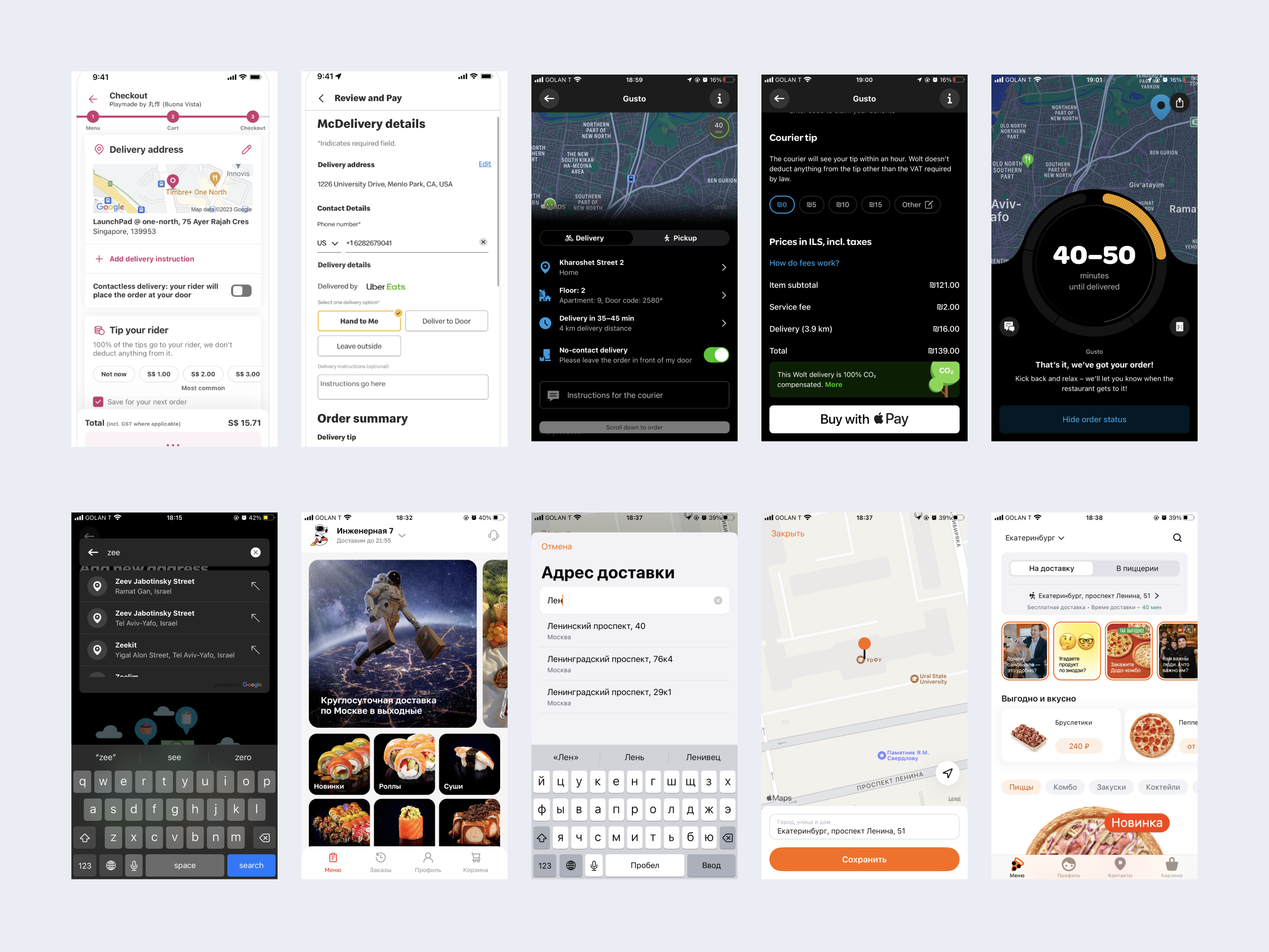
I gathered, analyzed, and organized over 40 references. I aimed to track recurring patterns and elements of modern app design through competitor analysis.

The trend turned out to be a clean and easy-to-perceive design. One color is used for accents, and one is used for highlighting minor details (promotions, new items, discounts, illustrations).
Additionally, the best practices were found to be: 1. The search bar is located on the main screen; 2. Section navigation is organized using the Bottom Navigation Bar; 3. The main screen includes a section for recent orders, so you can quickly place or repeat an order; 4. Categorization with quick access through chips.


Sketching
After collecting the references, I started to capture my ideas and the rough concept of the application. Visualizing my thoughts, defining the overall structure, and composing the interface elements became more attractive.
Design
The final design is based on functional requirements.
These screens include sections for: 1. First and second-level catalog with search, address with the option to edit, estimated delivery time label, dishes from the last order, and main dish categories; 2. Sales; 3. Cart with two options: one with a counter for added dishes and one without; 4. Profile.
The app is implemented with a dark theme option.
Navigation includes the ability to return to the previous screen. Each dish has a detailed description, pricing details, and the option to add it to the cart. The cart screen displays the number of dishes, their cards with information and the subtotal, and total with delivery.
Order placement occurs upon pressing the “Go to checkout” button on the Cart screen. The screen includes a section with the delivery address, delivery time, space for comments, and payment methods.
After placing an order, users see a successful confirmation or an error screen indicating an issue with the order processing.
I compiled a UI kit during the app design process, creating card layouts, various button states, and icons. This helped me save time in interface development and maintain design consistency.
What’s next?
In the future, I would like to conduct interface testing. I could set a task such as 'order a specific dish' and observe whether the user can accomplish it and whether the interface is clear. This could be done through hallway testing and on the Useberry website.
Testing